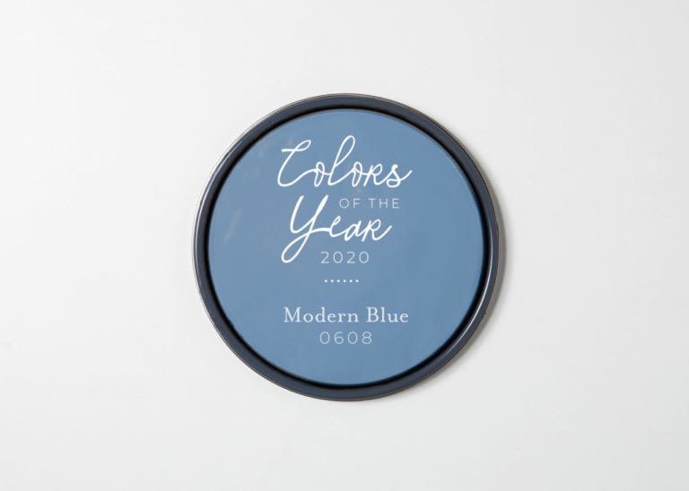
Parkwater: A Timeless Shade of Blue for Calm, Classic Interiors
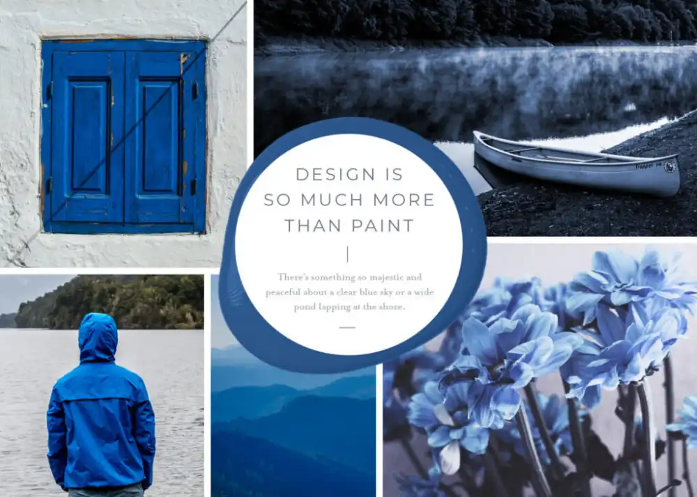
There’s something endlessly peaceful about a clear blue sky or the gentle ripples of a quiet pond on a warm spring day. Nature’s blues evoke renewal, reflection, and serenity—the feeling of breathing in fresh air and knowing life is moving forward.
Our Color of the Year, Parkwater, captures that same timeless tranquility. Inspired by sky and water, this soft yet deep blue brings harmony, balance, and calm into your home.

Simple. Classic.
Parkwater is a deep, muted blue that feels both grounded and elegant. It doesn’t demand attention; instead, it gently enhances the space it fills. Its understated beauty creates a soothing atmosphere that feels natural and effortless.
This classic tone pays homage to Pantone’s 2020 Color of the Year, Classic Blue, chosen for its dependable, stabilizing qualities. Like its inspiration, Parkwater brings a sense of balance—anchoring a room while remaining versatile enough for modern or traditional interiors.
A Color with Artistic Roots
Parkwater carries a quiet sophistication that echoes history. During the Impressionist period of the 1860s, artists such as Claude Monet and Édouard Manet developed similar blue pigments to capture the tranquil essence of sky and water. Their goal was simple: to communicate peace and beauty through color.
Today, Parkwater achieves the same. It’s a reminder that even in simplicity, there’s depth—and that some colors never go out of style. Its message is subtle yet powerful: everything is going to be okay.
Where to Paint Parkwater
Because Parkwater is a subtle, toned-down blue, it adapts beautifully to many areas of the home. It’s calming without feeling cold, and expressive without being overpowering.
Best Spaces for Parkwater
- Bedrooms: Create a restful retreat where soft blue walls promote relaxation and deep sleep.
- Living Rooms: Use it to set a tranquil tone for everyday life—perfect for unwinding or hosting.
- Home Offices: Encourage focus and mental clarity with this reflective shade.
- Bathrooms: Bring a spa-like calmness that echoes water and air.
Color Pairing Ideas
- Soft Neutrals: Pair Parkwater with cream, ivory, or pale pink for a light, airy aesthetic.
- Modern Metallics: Combine it with brushed nickel, chrome, or gold accents for a sophisticated edge.
- Monochrome: Use varying shades of blue to create a cohesive, layered look that feels serene yet dynamic.
Parkwater’s quiet strength makes it an ideal foundation color—calm enough for large walls, yet rich enough to stand out in accent spaces.
We’re Here To Assist
At James T. Davis, we believe that color has the power to transform not just rooms, but moods. Whether you’re drawn to the tranquil grace of Parkwater or exploring other timeless shades, our team is here to help you find your perfect match.
We offer expert color guidance, design advice, and free paint samples to help you see your vision come to life. Contact us today to begin your next home project—and let Parkwater bring peace and beauty into your space.